

Why Your Website Hero Section Is Costing You Clients
First impressions happen fast… really fast
When someone lands on your website, you have about 3 to 5 seconds to convince them to stay.
And where do their eyes go first?
👉 Your hero section (the top part of your homepage).
If that section is confusing, cluttered, or unclear, visitors won’t stick around. They’ll leave. No clicks. No leads. No conversions.
Let’s fix that.
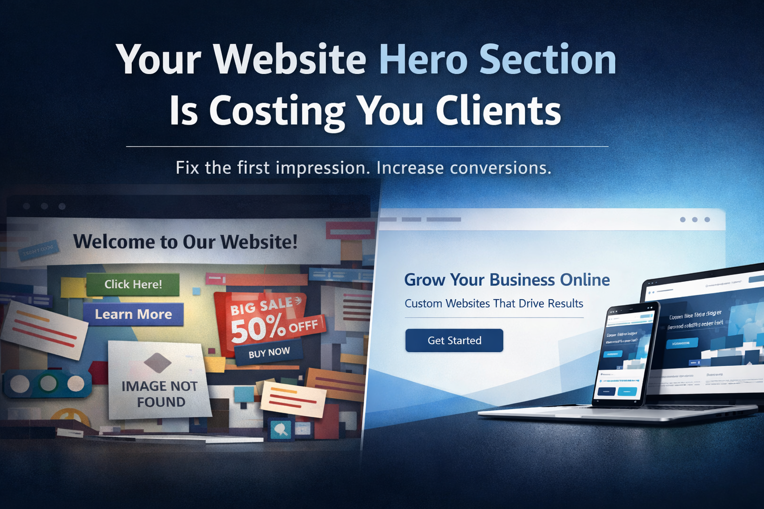
🚫 What Most Businesses Get Wrong
Your hero section should answer one simple question immediately:
“What do you do, and why should I care?”
But instead, many websites have:
Vague headlines like “Welcome to our website”
Too many buttons competing for attention
Generic stock images with no meaning
No clear next step
👉 The result: visitors feel lost and leave.
🧠 Why Your Hero Section Matters More Than You Think
Your hero section is not just design. It’s decision-making.
Visitors are subconsciously asking:
Is this relevant to me?
Can I trust this business?
What should I do next?
If your hero section doesn’t answer those questions quickly, you lose them.
✅ What a High-Converting Hero Section Looks Like
Here’s what actually works:
1. Clear, Specific Headline
Skip the fluff. Be direct.
❌ “We Build Amazing Experiences”
✅ “Custom Websites Designed to Turn Visitors Into Clients”
2. Supporting Subheadline
Explain your value in one short sentence.
👉 Example:
“Accessibility-first web design for businesses that want to grow online.”
3. One Strong Call-to-Action (CTA)
Not five. Just one primary action.
Get Started
Book a Call
View Our Work
Make it obvious and easy.
4. Visual That Supports Your Message
Your image or background should reinforce what you do.
Real website mockups
Clean UI visuals
Subtle motion or animation
Avoid random stock photos that don’t connect.
5. Clean, Focused Layout
Whitespace is your friend.
Less clutter = more clarity = better conversions.
⚡ Quick Fix Checklist
If you want to improve your hero section today, check this:
Can someone understand what you do in 3 seconds?
Is your headline clear and specific?
Do you have ONE main CTA?
Does your visual support your message?
Is the layout clean and easy to scan?
If you said no to any of these… there’s your opportunity.
💡 Real Talk
A “nice-looking” website isn’t enough anymore.
If your hero section doesn’t guide your visitors immediately, you’re losing potential clients every day without realizing it.
🚀 Final Thoughts
Your hero section is not just the top of your website.
It’s your first impression, elevator pitch, and conversion trigger all in one.
Get this right, and everything else becomes easier.
👉 Need Help Fixing Your Website?
If your site looks “fine” but isn’t bringing in leads, it’s time for a refresh.
At Twist Web Studio, we design websites that are:
Accessibility-first
Conversion-focused
Built with real strategy
Let’s turn your website into something that actually works.
👉 Visit www.twistwebstudio.com