
Accessibility
WCAG 2.2 Small Business Guide: What You Need to Know
Learn what WCAG 2.2 means for your small business website. A plain-language guide to new focus states, target sizes, accessible forms, and better usability.
Web accessibility guidelines update every few years to match how people use digital devices. The World Wide Web Consortium released version 2.2 of the Web Content Accessibility Guidelines, known as WCAG. This update builds on earlier standards by focusing heavily on mobile users, people with cognitive disabilities, and visitors with low vision.
If you run a business, understanding WCAG 2.2 small business priorities helps you build a site that works smoothly for everyone. You do not need a degree in computer science to understand these rules. Here is a practical, plain language breakdown of the newest success criteria and how they apply to your site.
Why WCAG 2.2 Matters for Your Business
The standard baseline for digital compliance is WCAG 2.2 Level AA. Federal guidelines, state policies, and international laws point to Level AA as the target for commercial websites. When you meet these standards, you protect your business while serving a broader audience.
Accessibility is not just about avoiding legal friction. It is about removing obstacles between your customer and your services. The newest criteria focus on practical usability. They fix common frustrations like tiny buttons, hidden focus indicators, and overly complicated login forms. When your website is easier to navigate, more visitors complete your contact forms and complete purchases.
Making Focus States Clear and Visible
Many people navigate websites using a keyboard, switch device, or screen reader instead of a mouse. As they press the tab key, an outline moves from link to link. This visual indicator is called a focus state. If the focus state disappears, the user has no idea where they are on the page.
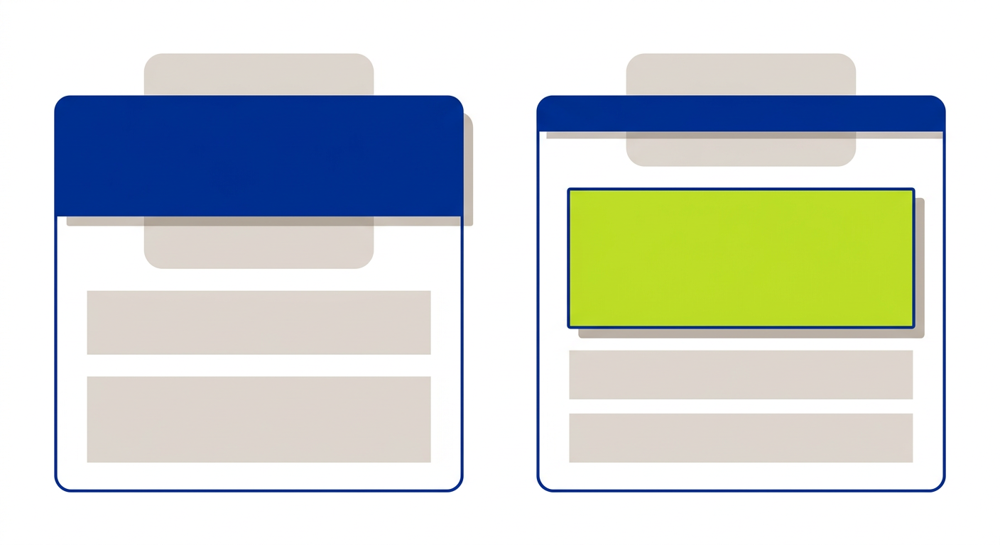
WCAG 2.2 introduces rules to ensure focus indicators are never obscured. Sticky headers, floating promo bars, and fixed chat widgets often overlap interactive items when a user tabs down a page. Under the new criteria, the focused element must remain visible. If a fixed bar covers a button when focused, your site fails the standard.
The guidelines also require focus indicators to have sufficient size and contrast. Thin, faint grey outlines do not pass. Your design needs high contrast rings or solid background changes that clearly stand out.
Better Touch Targets and Pointer Controls
Small buttons on mobile screens frustrate everyone, but they present a massive barrier for people with hand tremors or motor control challenges. WCAG 2.2 sets a clear physical size standard for buttons, links, and form controls.
The new target size requirement states that interactive controls must be at least 24 by 24 CSS pixels. If a button is smaller than that size, it must have enough spacing around it so a user cannot accidentally tap an adjacent link. This rule makes mobile navigation vastly more forgiving.
Another addition covers dragging movements. If your site features drag and drop actions, like reordering items in a cart or moving a slider, you must provide a single pointer alternative. Users must be able to click simple up and down arrows or select options from a dropdown instead of holding down a button to drag.
Simplifying Forms and Authentication
Forms are where business transactions happen. WCAG 2.2 introduces two important rules to eliminate unnecessary mental effort and friction during checkout or contact submission.
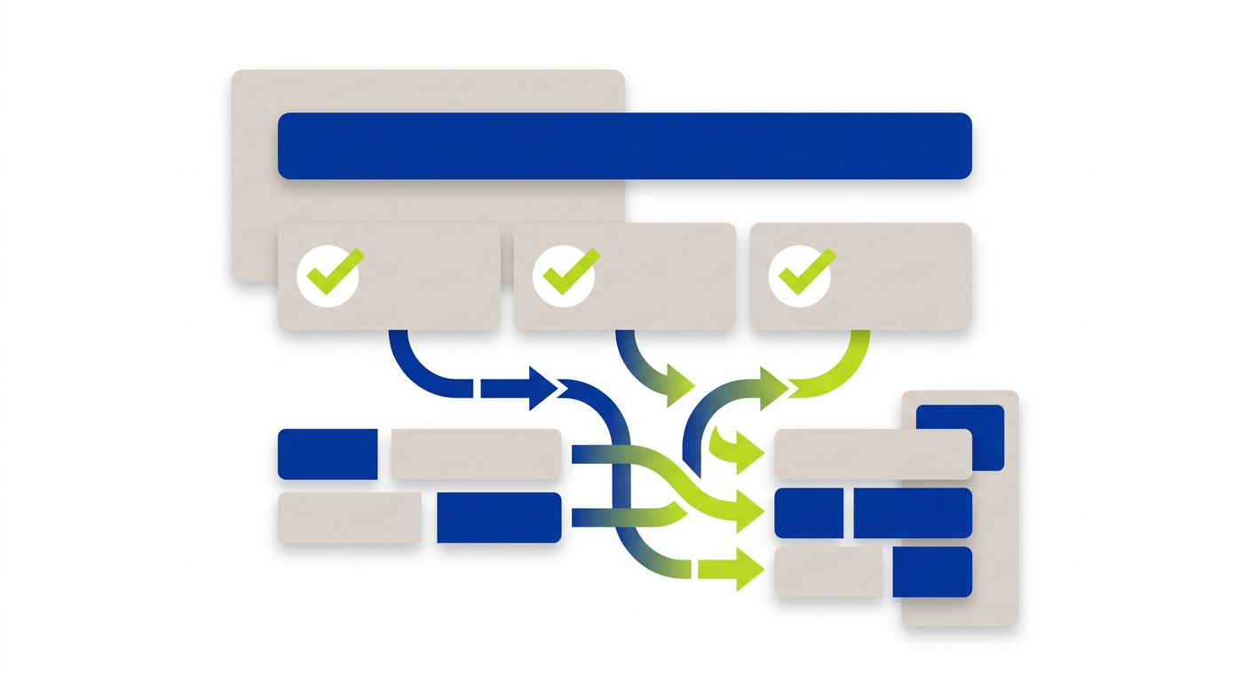
The first rule is redundant entry prevention. Your website should not force users to type the exact same information twice in the same session. For instance, if a customer enters their shipping address, your checkout form should offer a checkbox to automatically copy that data into the billing address fields.
The second rule covers accessible authentication. Logging into an account should not require a cognitive function test. Memory puzzles, transcribing distorted text images, or solving math problems during login create huge barriers for people with cognitive disabilities or memory loss.
Your site should support password managers, allow copy and paste actions into password fields, or offer simple magic links sent via email. Authentication should be as seamless as possible.
Keeping Help Options Consistent
When customers get stuck, they look for support. WCAG 2.2 adds a requirement for consistent help placement across your website. If you provide contact details, phone numbers, self help links, or a messaging feature, those tools must appear in the same relative location on every page.
If your phone number is in the top right header on your homepage, keep it in the top right header across all secondary pages. Moving help features around causes confusion for users who rely on predictable layouts.
Practical Checklist for Small Business Owners
Updating your site to meet WCAG 2.2 guidelines does not require a complete rewrite. You can start with a few simple audits of your existing pages.
- Test your site using only the Tab key to confirm your focus ring never gets hidden behind sticky headers or chat boxes.
- Check all mobile buttons and interactive links to verify they meet the 24 by 24 pixel minimum target area.
- Ensure your login and password fields allow users to copy and paste text directly from password managers.
- Add checkboxes to multi-step forms so users do not have to retype names or addresses.
- Provide simple button controls anywhere you currently require dragging or sliding gestures.
- Verify that help buttons, phone numbers, and contact links stay in the exact same spot on every page.
Building an accessible website is an ongoing practice of refinement. At Twist Web Studio, we build accessible websites from the ground up so your business reaches every customer cleanly and naturally. Reach out to our team if you want a practical review of your current site.