

The Psychology Behind “Click Here” vs Better CTA Buttons
Let’s start with something simple…
You’ve seen this button everywhere:
👉 “Click Here”
It’s generic. It’s vague. And in 2026… it’s costing you clicks.
Your call-to-action (CTA) buttons are one of the most important parts of your website. They guide users, drive decisions, and ultimately determine whether someone becomes a client.
So why do so many websites still get them wrong?
Let’s break it down.
🧠 What a CTA Button Actually Does
A CTA button isn’t just a button.
It’s a decision trigger.
When someone lands on your site, they’re subconsciously asking:
What should I do next?
Is this worth my time?
Can I trust this business?
Your CTA answers all three.
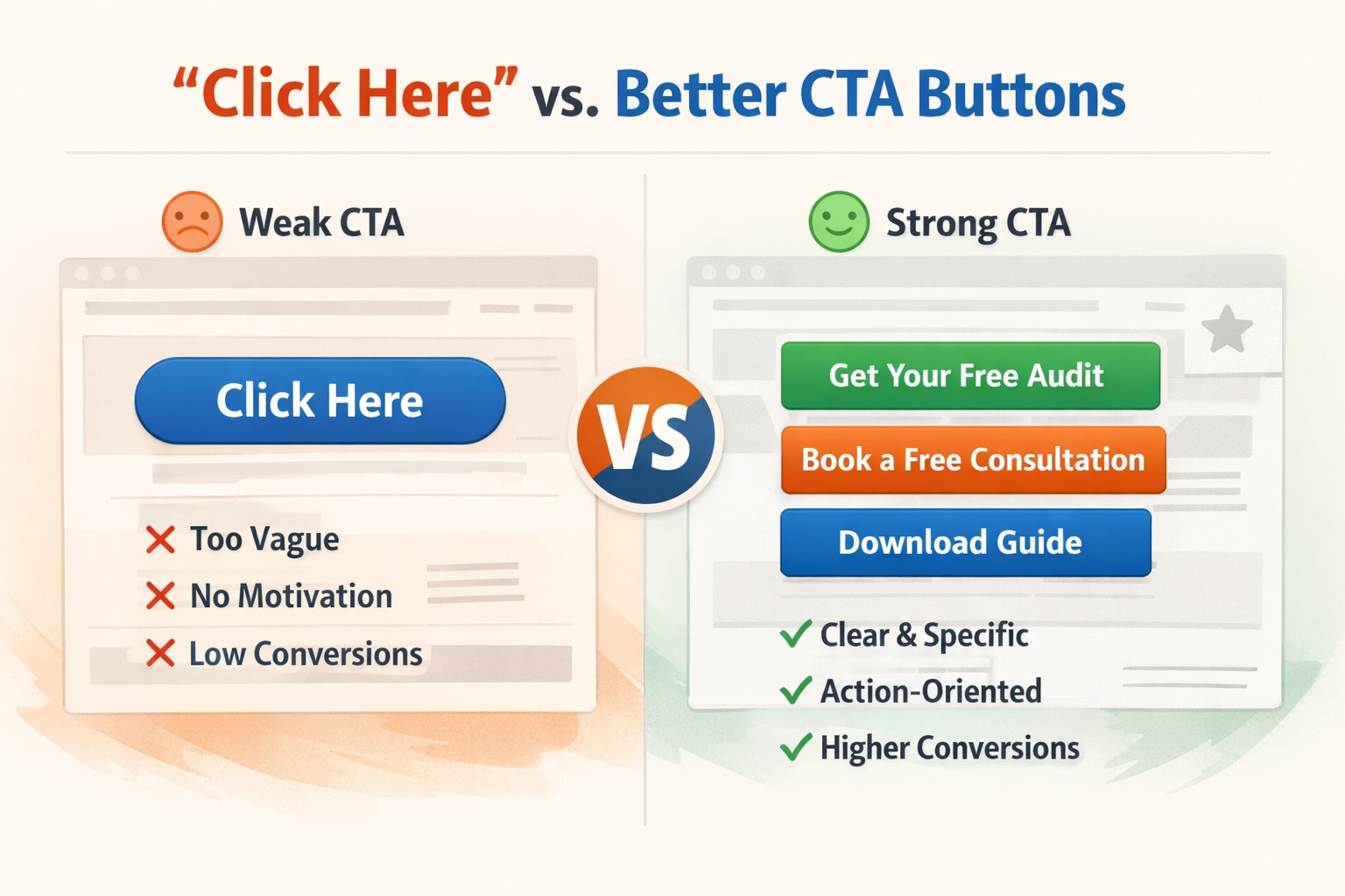
🚫 Why “Click Here” Doesn’t Work
“Click Here” fails for one simple reason:
👉 It doesn’t tell users what happens next.
There’s no clarity. No benefit. No motivation.
Compare this:
❌ Click Here
✅ Get Your Free Website Audit
✅ Book Your Free Consultation
✅ See Pricing
One is passive. The others are action-driven and specific.
⚡ The Psychology Behind High-Converting CTAs
Great CTA buttons tap into human behavior.
Here’s how:
1. Clarity Beats Creativity
People don’t want to guess.
👉 The clearer your CTA, the higher your conversions.
Example:
❌ “Explore”
✅ “View Website Packages”
2. Action-Oriented Language
Start with a verb.
Get
Start
Book
Download
👉 This creates momentum.
3. Value First, Not Effort
Users care about what they gain, not what they have to do.
❌ “Submit”
✅ “Get My Free Checklist”
4. Reduce Friction
People hesitate when something feels like work.
👉 Good CTAs feel easy and low-risk.
“No commitment”
“Takes 2 minutes”
“Free download”
5. Visual Contrast Matters
Even the best wording won’t work if the button is hard to see.
Your CTA should:
Stand out from the background
Be easy to tap (especially on mobile)
Have enough spacing around it
🔥 CTA Examples That Actually Work
Here are some strong CTA upgrades:
“Click Here” → “Get Started Today”
“Learn More” → “See How It Works”
“Submit” → “Send My Request”
“Contact Us” → “Book a Free Call”
👉 Notice the difference?
They’re specific, clear, and benefit-driven.
📱 Don’t Forget Mobile Users
Most users are on their phones.
That means your CTA should be:
Large enough to tap
Positioned where it’s easy to reach
Not buried under content
👉 If users have to search for your CTA, you’ve already lost them.
⚠️ Common CTA Mistakes to Avoid
Too many buttons competing for attention
Weak or generic wording
No clear next step
Buttons that blend into the design
Overwhelming users with choices
👉 One page = one primary action.
⚡ Quick CTA Fix Checklist
Ask yourself:
Does my CTA clearly say what happens next?
Does it highlight value?
Is it easy to find and click?
Is there only one main action?
If not, it’s time for an upgrade.
💡 Real Talk
You don’t need more traffic.
You need better decisions from the traffic you already have.
And your CTA plays a huge role in that.
🚀 Final Thoughts
Your website should guide users, not confuse them.
A strong CTA button is like a clear signpost:
👉 “Go here next.”
Make it obvious. Make it easy. Make it worth it.
👉 Want Better Conversions Without Redesigning Everything?
Sometimes small changes make the biggest difference.
At Twist Web Studio, we focus on:
Conversion-focused design
Accessibility-first experiences
Strategic user flow
👉 If your website isn’t converting, let’s fix that.
Visit: www.twistwebstudio.com