

🎨 What Your Website Colors Say About Your Brand (And Why It Matters)
🎯 Your colors are speaking… even when you’re not
Before someone reads a single word on your website, they’ve already formed an opinion.
And a big part of that?
👉 Color
Colors influence:
trust
emotion
decision-making
If your color choices are off, your website might feel “wrong”… even if everything else looks fine.
🧠 Why Color Psychology Matters in Web Design
Color isn’t just about aesthetics.
It’s about perception.
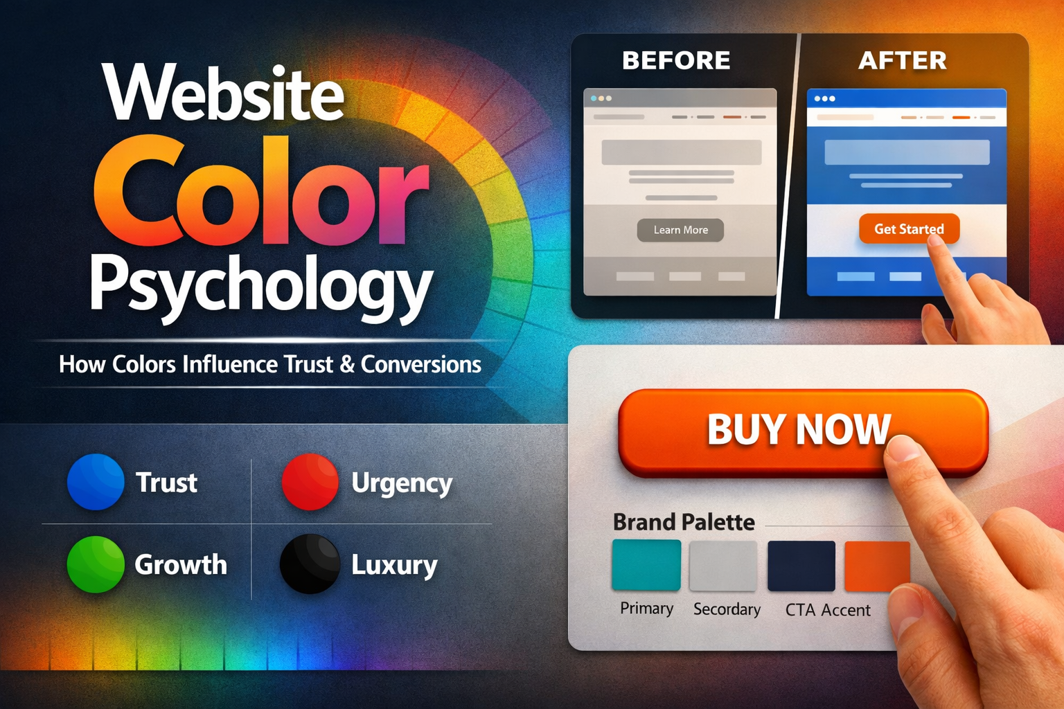
Users subconsciously associate colors with meaning:
Blue = trust, reliability
Red = urgency, action
Green = growth, calm
Black = luxury, authority
Orange = energy, friendliness
👉 The right color builds confidence
👉 The wrong color creates hesitation
🎨 Common Color Mistakes Businesses Make
🚫 1. Choosing Colors Based on Preference (Not Strategy)
“I like this color” is not a strategy.
Your colors should reflect:
your brand personality
your audience
your industry
🚫 2. Too Many Colors Competing for Attention
When everything is colorful… nothing stands out.
👉 This creates confusion and visual overload.
🚫 3. Poor Contrast (Hard to Read)
If users struggle to read your content, they won’t stay.
This is especially important for:
accessibility
mobile users
older audiences
🚫 4. Weak CTA Colors
Your call-to-action button should stand out.
If it blends in, users won’t click it.
✅ How to Choose the Right Website Colors
1. Start With Your Brand Personality
Ask:
Are you professional or playful?
Modern or traditional?
Bold or minimal?
👉 Your colors should match your vibe.
2. Use a Simple Color System
Stick to:
1 primary color
1–2 secondary colors
1 accent color (for CTA)
👉 Simplicity = clarity
3. Design for Accessibility First
Make sure:
Text is easy to read
Colors have strong contrast
Nothing relies on color alone
👉 Good design includes everyone.
4. Make Your CTA Pop
Your CTA button should:
contrast with the background
be easy to see immediately
guide users clearly
👉 This directly impacts conversions.
🔥 Real Example
Let’s say your website uses soft gray and beige everywhere.
It might look “clean”… but:
👉 Where does the user click?
Now add a bold accent color for your CTA.
Suddenly:
attention improves
clicks increase
conversions go up
⚡ Quick Color Checklist
Does my color match my brand identity?
Is my text easy to read?
Do I have too many colors?
Does my CTA stand out clearly?
If not, there’s room to improve.
💡 Real Talk
Color is one of the most overlooked parts of web design.
But it’s also one of the most powerful.
👉 Small color changes can lead to big results.
🚀 Final Thoughts
Your website isn’t just seen.
It’s felt.
And color plays a huge role in that experience.
If your website feels off… your color choices might be the reason.
👉 Want a Website That Looks Good AND Converts?
At Twist Web Studio, we design with intention.
Accessibility-first
Conversion-focused
Strategy behind every detail
👉 Let’s make your website work smarter
Learn more about common website hero section mistakes
Your CTA plays a huge role in conversions. If you’re unsure what works, check out these CTA button examples.