
Case study · 2025
HulaBellaBuilt for clarity.
A bold Deaf-owned apparel shop, revamped so the products lead and checkout stays out of the way.
Visit the live site- Client
- HulaBella
- Industry
- Retail / apparel
- Platform
- Squarespace
- Year
- 2025
- Services
- Website Redesign, Small Business Websites, Accessibility
01 · The problem
The challenge
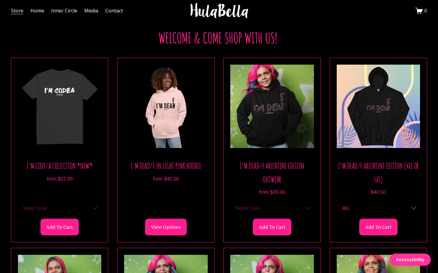
The shop had strong designs and a loyal following, but the storefront buried products behind cluttered pages and a checkout path that was awkward on a phone.
02 · The approach
The strategy
Put the products first. A dark, high-energy storefront that matches the brand, with size selection and add to cart visible on every product card.
03 · Accessibility
Accessible by default, not as an afterthought.
Contrast raised across the dark palette for product and price text
Keyboard-operable size selectors and cart controls
Descriptive alt text on product photography
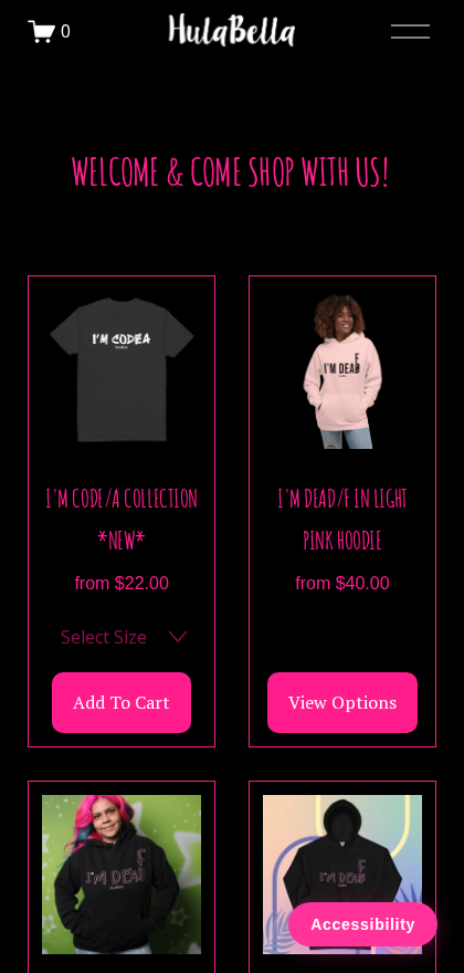
Readable type sizes on phones without zooming
04 · Execution
What we changed
- Rebuilt the storefront so products are the first thing visitors see
- Moved size selection and add to cart onto the product cards
- Tightened the mobile shopping and checkout flow
- Cleaned up navigation down to store, home, community, media, and contact
05 · The outcome
Results
- Increased after launch
- Orders
- Products first
- Storefront
- Simplified
- Mobile checkout
More work
View all projects
Your turn
Start a similar project.
If HulaBella sounds like where you are today, we'd like to hear about your site.