Case study · 2025
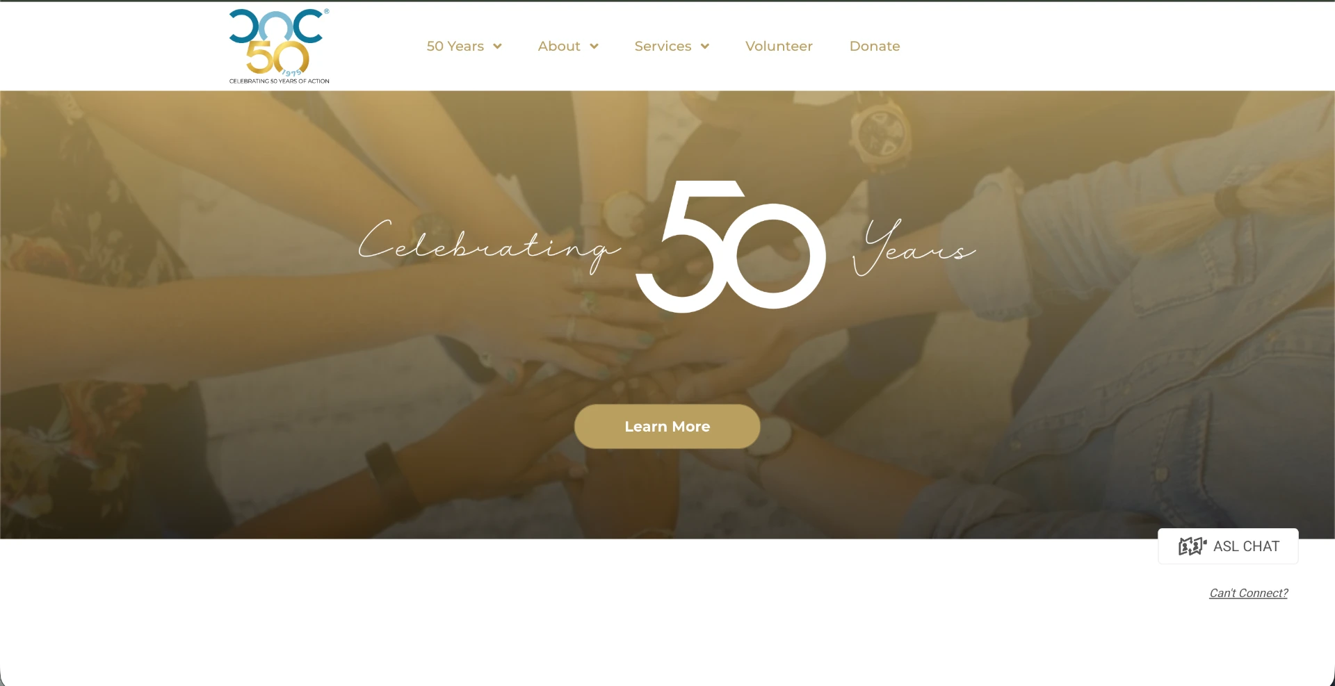
NASLECEBuilt for clarity.
A refreshed national education site that makes research, resources, and membership easier for every visitor to find.
- Client
- National ASL and English Bilingual Consortium for Early Childhood Education
- Industry
- Education / nonprofit
- Platform
- Wix
- Year
- 2025
- Services
- Website Redesign, Accessibility, Nonprofit Websites
01 · The problem
The challenge
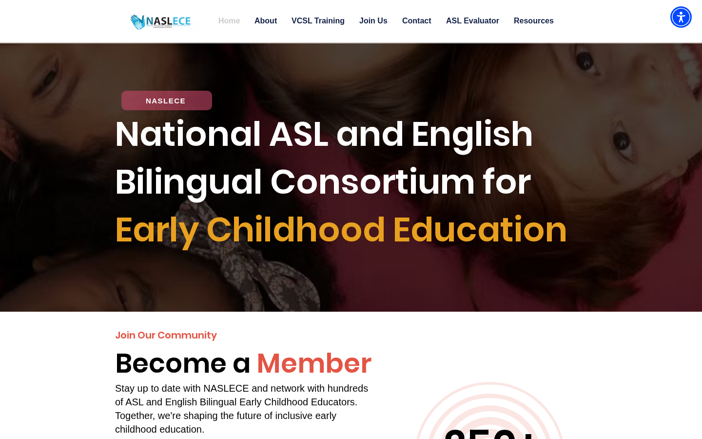
NASLECE's previous site buried important resources under dense navigation and inconsistent page layouts, making it hard for educators and families to find what they needed.
02 · The approach
The strategy
Rebuild around discoverability: a clearer information architecture, stronger visual hierarchy, and a consistent experience that guides visitors to resources instead of overwhelming them.
03 · Accessibility
Accessible by default, not as an afterthought.
Consistent heading structure and logical reading order
Improved color contrast and readable type sizing
Keyboard-navigable menus and resource lists
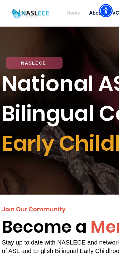
Mobile-first, responsive layouts tested at multiple sizes
04 · Execution
What we changed
- Reorganized navigation and page structure for clearer wayfinding
- Improved visual hierarchy and readability across the site
- Strengthened mobile responsiveness and accessibility
- Made key resources and membership information easier to discover
05 · The outcome
Results
- Improved
- Resource discoverability
- Refreshed
- Mobile experience
- Centered
- Accessibility
More work
View all projects
Your turn
Start a similar project.
If NASLECE sounds like where you are today, we'd like to hear about your site.